Imagine this: you've got mounds of data and you're itching to make sense of it all. Charts are a great way to go from chaos to clarity. Obsidian itself is a pretty nifty tool. It's like the Swiss Army knife for knowledge management, but what if you could level up your note-taking game with interactive, dynamic charts, transforming your Obsidian vault into a data visualization powerhouse?
As you might already be aware, thanks to the amazing Obsidian community, we can take advantage of many plugins take our Obsidian experience to new heights. In this blog post, I'll go through four must-have community plugins for data visualization: Charts, Contribution Graph, Heatmap Calendar, and Ledger.
Charts
Before we jump in, let's tackle the million-dollar question: which chart is best suited for your data? The answer depends on understanding the unique strengths of each chart type.
That's why I'll start with the most comprehensive plugin of the four: Charts. It offers six different chart types—bar, line, pie, doughnut, polar area, and radar. I'll walk you through each one using a real-world example.
Bar Chart: The All-Star Performer
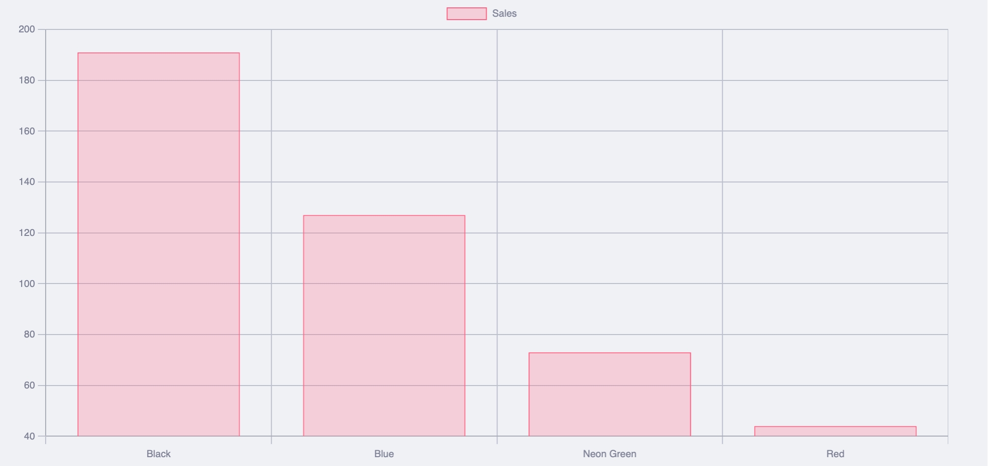
Imagine you own a store specializing in T-shirt sales, and you're curious about which colors fly off the shelves. A Bar Chart is your MVP. It's straightforward, clean, and allows for easy side-by-side comparisons. Each bar represents a different color, with the height reflecting sales figures.
Voilà! You now know neon green is all the rage.
Line Chart - The Story Teller
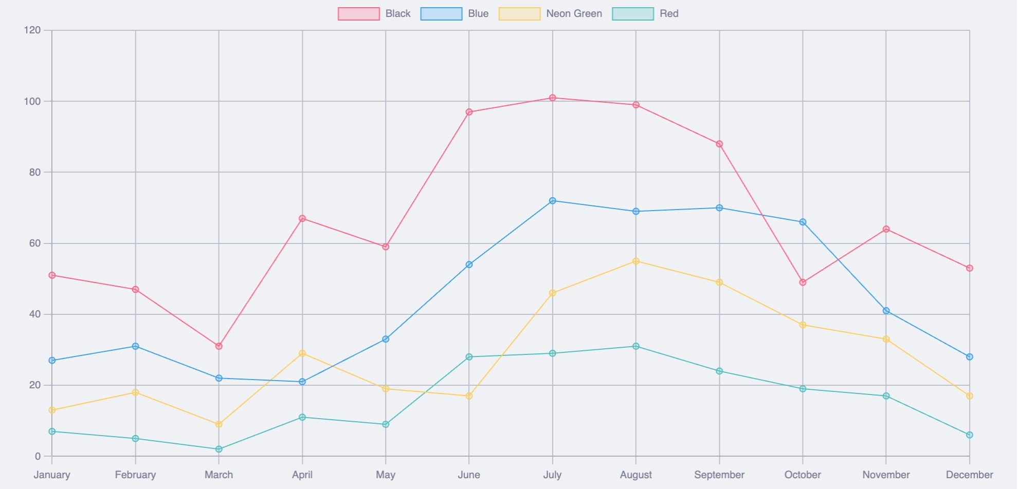
Perhaps you're interested in discovering the most popular colors over the past year. The Line Chart is your go-to tool here. It connects the dots over a timeline, revealing trends and patterns. You'll see which colors had their moment in the sun and which were left gathering dust.
Perfect for anyone who loves a good narrative arc.
Pie and Doughnut Charts: The Showstoppers
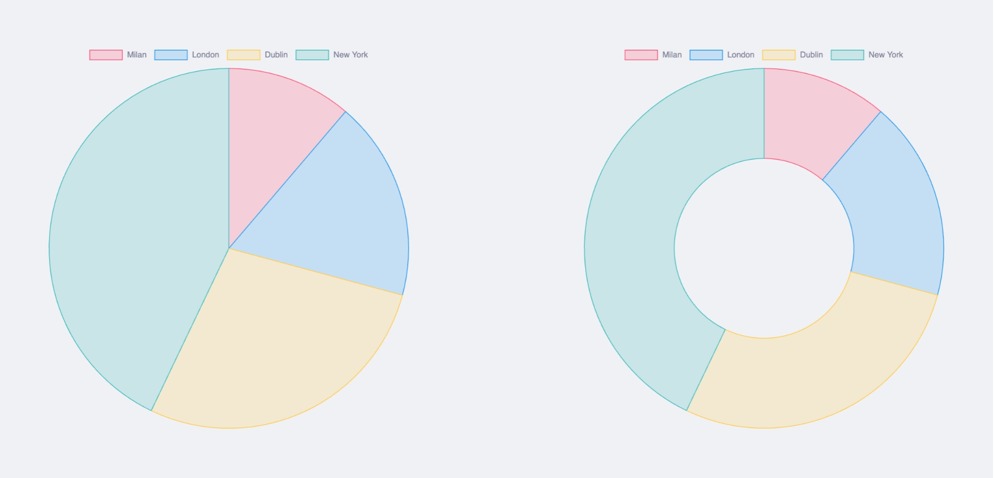
Assuming you're managing multiple stores, you might need to show how T-shirt sales stack up across locations. Enter the Pie Chart, gracefully breaking down each store's contribution to the total sales.
Fancy something a bit flashier? The Doughnut Chart offers the same perks but with a hole in the middle, helping viewers focus on the length of the arcs rather than getting dazzled by the areas. Because sometimes, it's about emphasizing the edges, not the center.
Polar Area Chart: The Time-Traveler
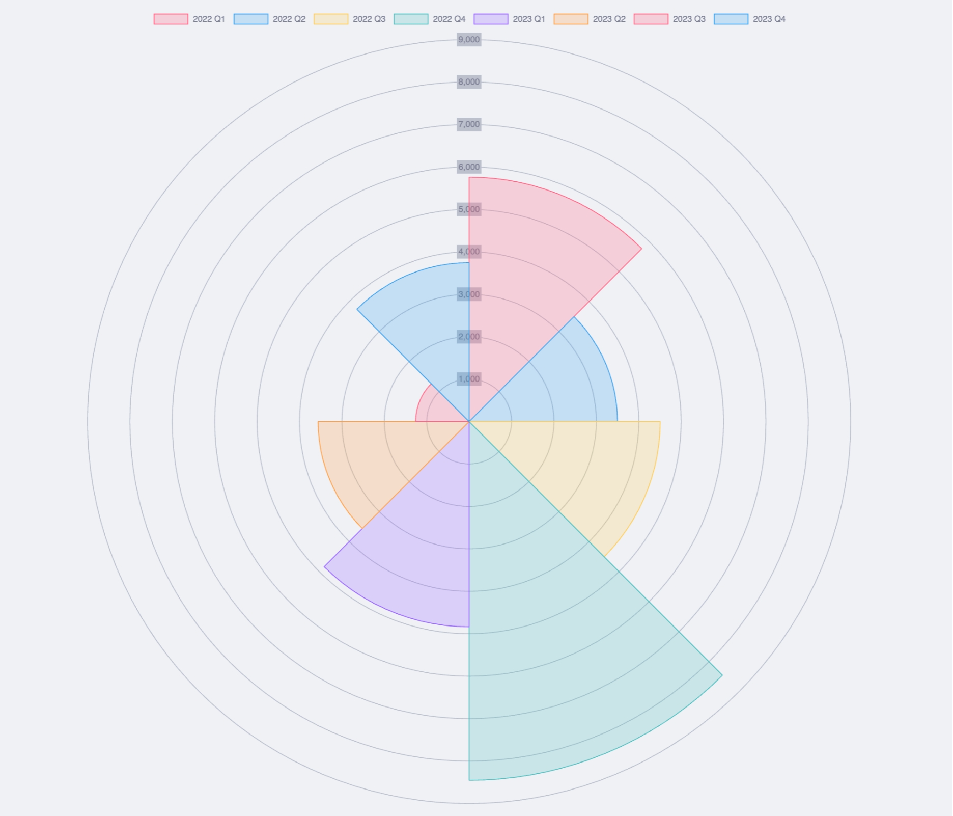
Looking to evaluate your T-shirt sales statistics over the past two years, broken down by quarters? The Polar Area Chart is the perfect tool for the job. It excels at visualizing cyclical data patterns, making it easy to spot those seasonal spikes and dips.
Imagine it as your data time machine, guiding you through two years of sales trends with a visually engaging radial design.
Radar Chart: The Performance Reviewer
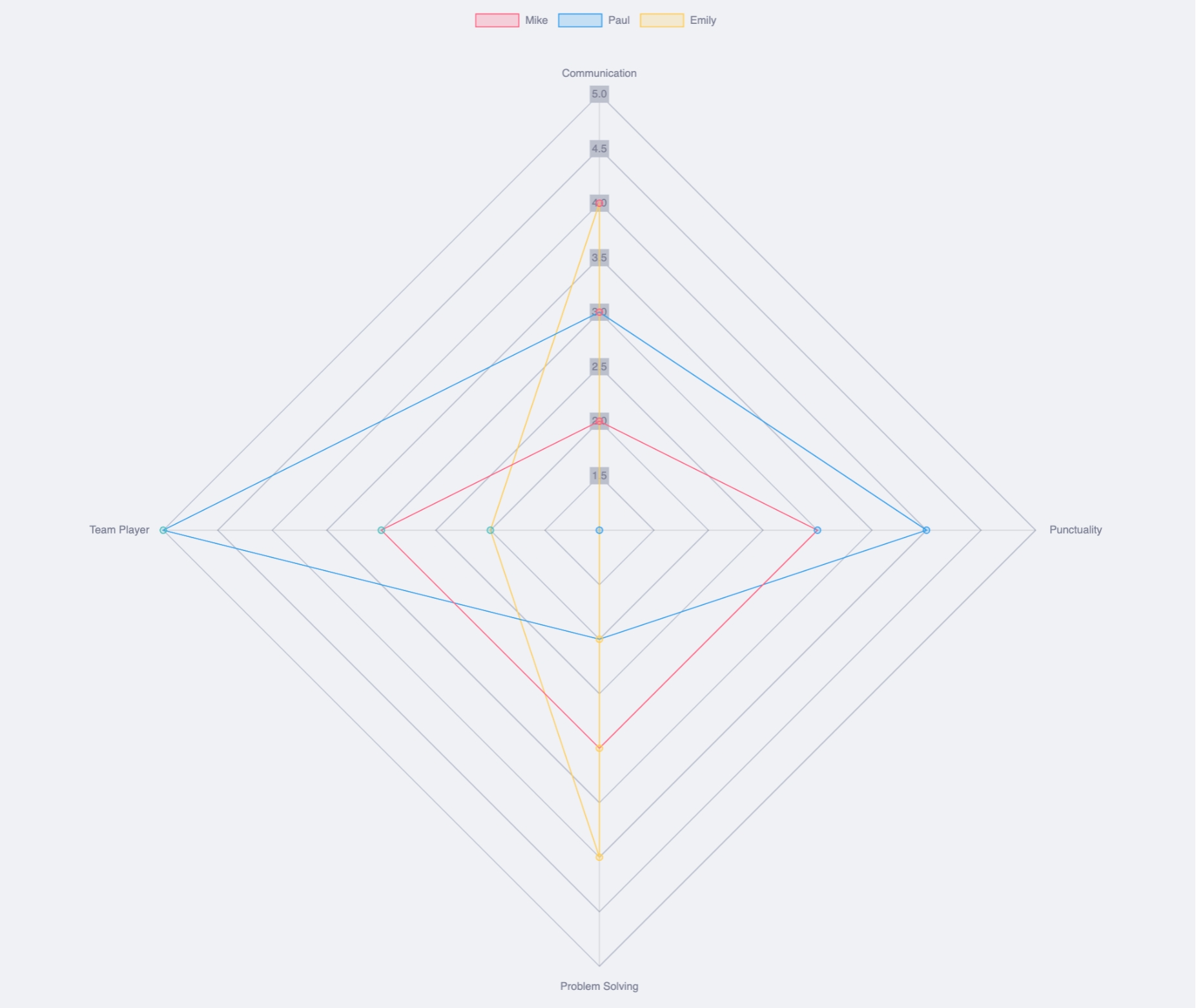
Let's talk about employee performance. The Radar Chart provides a two-dimensional visualization for multivariate data, perfect for plotting multiple performance metrics on a single chart. Store managers' scores for staff performance can be captured and visualized, helping you identify star employees and areas needing improvement.
Keeping everyone on their toes and boosting morale–not to mention healthy competition–has never been easier.
Improve Charts Customization with DataviewJS
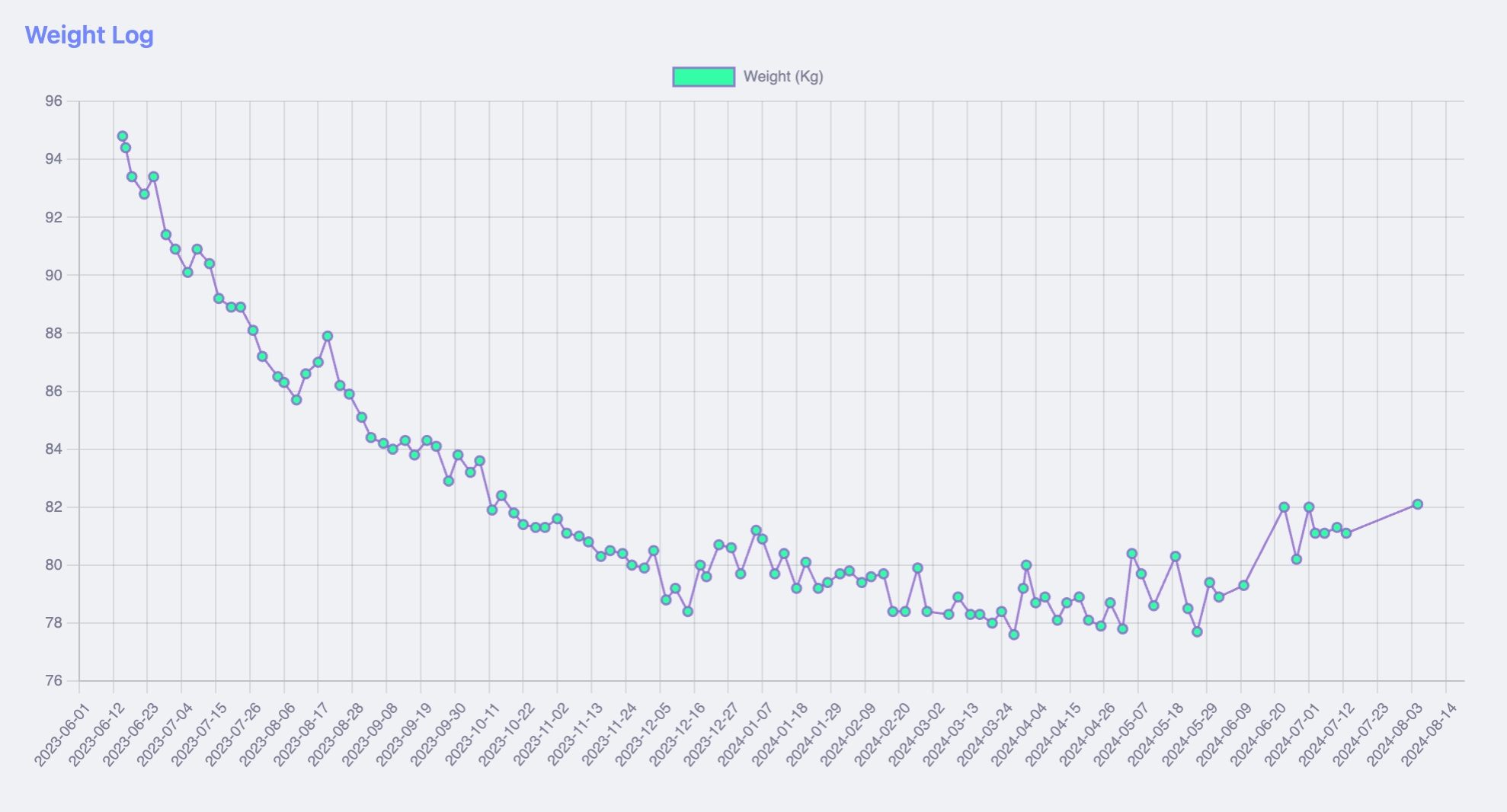
All the charts above can easily represent data from a table, but for the tech-savvy among you, these charts become even more powerful when built with DataviewJS. This tool allows you to pull data directly from the YAML frontmatter of your notes across your entire vault. For instance, you might use it to track something like your weight over time.
Suppose you record your weight in daily notes using a simple property called "weight". With DataviewJS, you can easily create a line chart that compiles data from all these notes:
```dataviewjs
dv.span("**Weight Log**")

const pages = dv.pages('#daily_note and -"Templates"').sort(p => p.file.name)
const dates = pages.map(p => p.file.name)
const weights = pages.map(p => p.weight).values

const chartData = {
	type: 'line',
	data: {
		labels: dates,
		datasets: [{
			label: 'Weight (Kg)',
			data: weights,
			backgroundColor: [
				'rgba(53, 252, 167, 1)'
			],
			borderColor: [
				'rgba(138, 102, 204, 0.8)'
			],
			borderWidth: 1.5,
			spanGaps: true,
		}],
	},
};

window.renderChart(chartData, this.container)
```
This is the result:
Check out my video tutorial on Charts here: ⤵︎
Contribution Graph
The charts we've covered so far are just a few of the many options available in Obsidian. Another powerful and versatile visual tool you can leverage is the heatmap. Heatmaps are particularly useful for comparative analyses, pattern recognition, density visualization, and even habit tracking.
To get started with heatmaps in Obsidian, you can use a user-friendly "no-code" plugin called Contribution Graph. This plugin allows you to create heatmaps effortlessly, providing a straightforward interface that generates the graph for you.
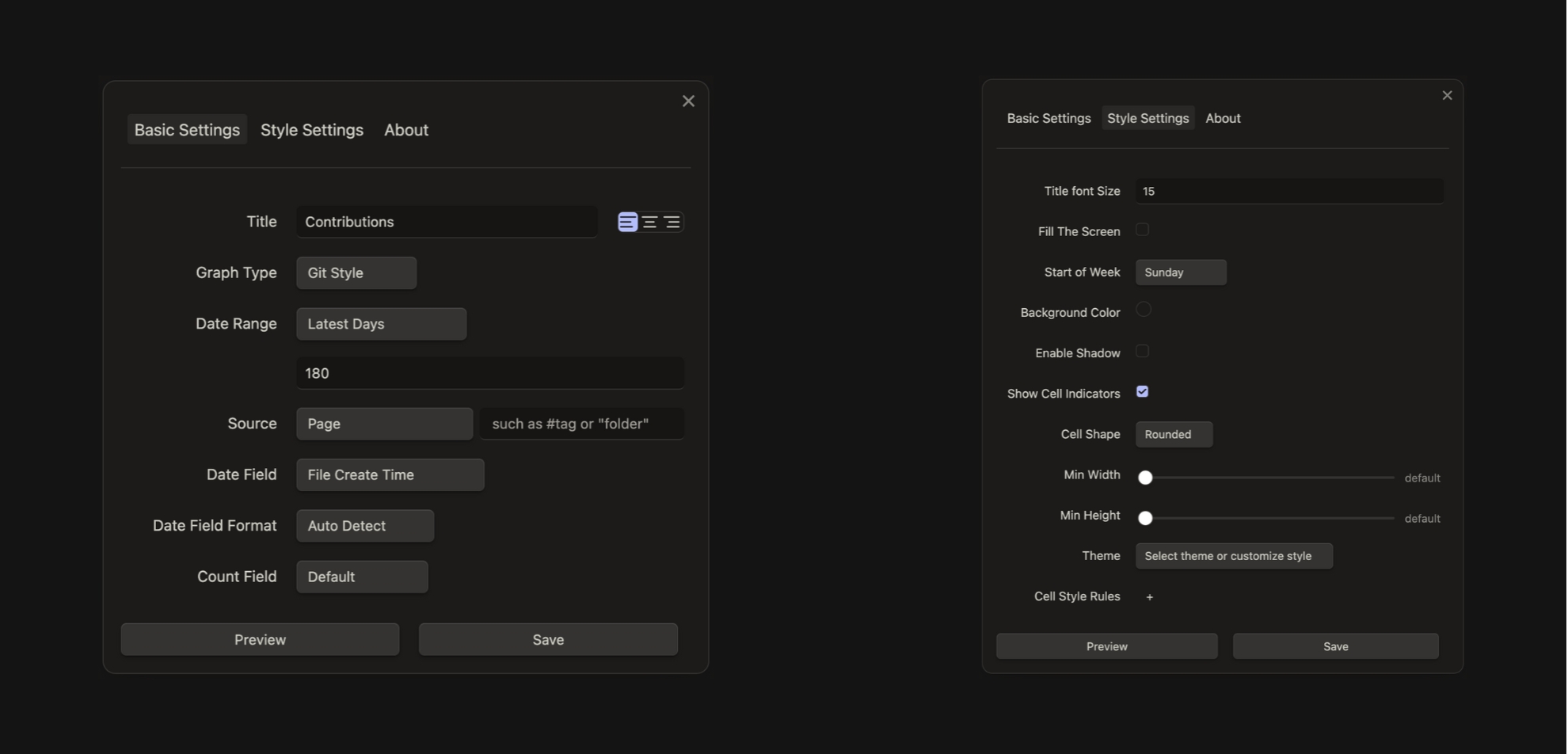
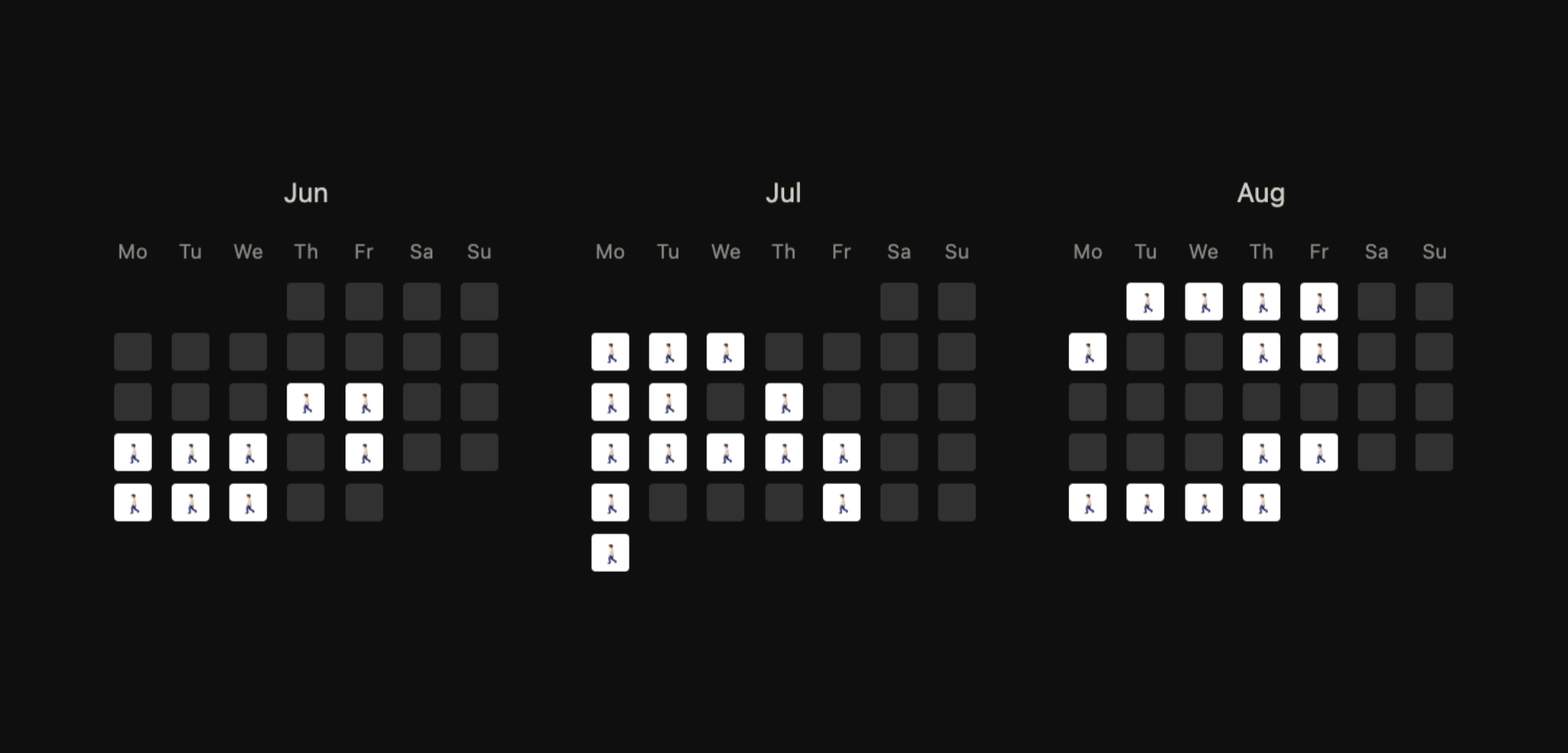
Despite their simplicity, these graphs are visually appealing and highly effective. Personally, I find them perfect for straightforward habit tracking!
If you're interested in this plugin, I published a video about it; you can find it here: ⤵︎
Heatmap Calendar
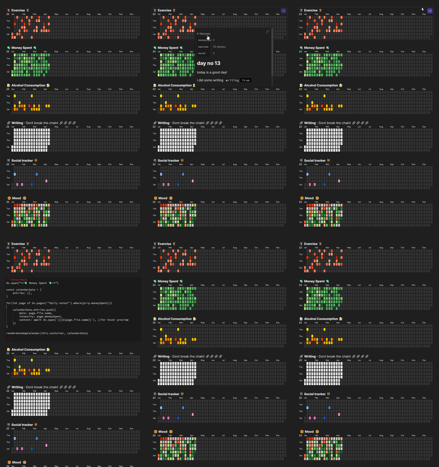
Now, if you found Contribution Graph to be a solid choice for creating heatmaps, Heatmap Calendar takes it to the next level. This plugin is incredibly versatile, allowing you to track everything from exercise and finances to social activities, project progress, and passions.
The real standout feature is its complete customization—you can tailor it to perfectly fit your specific needs. However, this flexibility comes with a price: building a heatmap with Heatmap Calendar requires a basic understanding of JavaScript. Additionally, it's important to note that this plugin only works in conjunction with Obsidian Dataview. (You can check out my video introduction to Dataview here).
Ledger
Lastly, if you're looking to take control of your finances, Ledger is the perfect tool to help you achieve that. The "Obsidian x Ledger" combination offers a secure, transparent, and highly manageable solution for personal finance. It seamlessly tracks your expenditures, income, and financial transfers, all within the comfort of your Obsidian vault.
Ledger is straightforward to set up, storing all your financial data as plain text in your Obsidian vault, and it's fully compatible with any tool that supports the Ledger CLI. Its interactive dashboard provides an at-a-glance view of your accounts, transactions, and balances. You can easily adjust transaction aggregation intervals and define date ranges for customized financial reports, making it simple to stay organized.
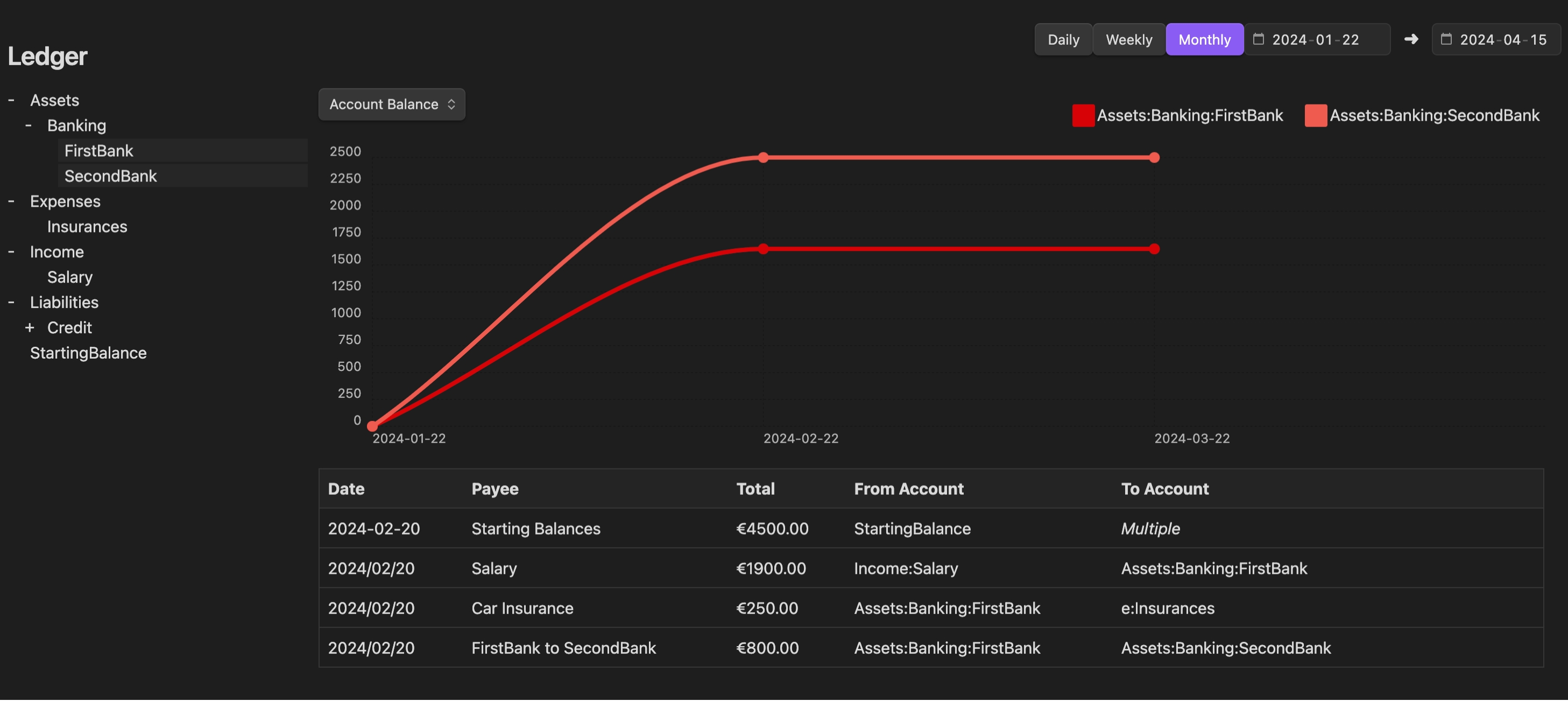
Regular updates and intuitive visual dashboards keep you on top of your personal finances, helping you stay aligned with your financial goals.
If you're interested in this plugin, check out my video introduction to Ledger here: ⤵︎
Conclusion
Obsidian can be more than a simple note-taking app; with the right community plugins, data visualization has never been simpler or more accessible. Whether you're managing sales data, tracking personal goals, or analyzing performance, these plugins turn your raw data into clear, insightful charts.


.png)


